Case study: How to brand a prairie

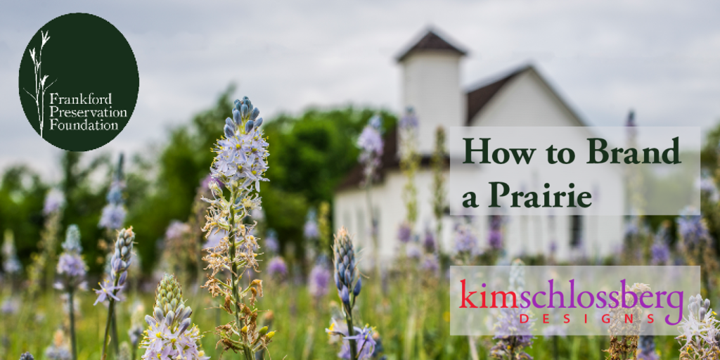 Introducing: new logo for Frankford Preservation Foundation
Frankford Preservation Foundation is a hidden jewel in far north Dallas. The organization discovered and is preserving a pure, virgin prairie right in the middle of a subdivision.
I’m very honored that they asked Kim Schlossberg Designs to help them with their logo and branding for this wonderful organization.
We started this logo design project as we always do – getting to know the client and the product – in this case, the lovely prairie, and the adjoining historical church, cemetery, and Indian Spring. Here are a few of my amateur photos of the grounds. You can see gorgeous professional photographs on their website.


Talking to the organization’s president, I learned that finding a native a grass called Big Bluestem on the grounds was a very important discovery. This grass indicates that the native prairie has never been plowed – that it is, in fact, a pure, native prairie. So the Big Bluestem is a very meaningful symbol to everyone involved in the foundation. We knew we wanted to incorporate it into the logo in some meaningful way.
By a sheer stroke of creative luck, Teresa Wyatt, of Off Avenue Studio, had given me a gorgeous hand-printed bookmark several years ago. As luck would have it, I noticed her bookmark on my bookcase at just the right time. Teresa uses actual botanical materials (leaves, stems, flowers) as her printing plates. I realized there would be no better way to represent the Big Bluestem than by using an original print using the actual plant.
We went to the prairie and harvested some prime specimens of the plant, and Teresa did her magic. Here are some photos of the Big Bluestem prints she made for us. As you can see, her work is gorgeous and we had a lot of options.


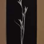
But which of the several prints would be most effective in a logo? After experimenting with some of the other images, we decided the most simple – the reverse image (dark background with white plant) – would be the clearest, most powerful logo.
I researched fonts and found one that worked on three levels. The church on the site was built in 1897, and I wanted a historical font that would be representative of that era. I wanted a softer, slightly organic form that would complement the botanical shapes. And most important, I wanted something strong and legible since this is for a corporate identity. I found Ronaldson. You can read the whole, fascinating (to type nerds) history of this font, but for this post, I’ll just tell you that it’s based on American classic Ronaldson Old Style, a metal face dating back to 1884. It was a best selling and most unique American text face of the nineteenth century, all the way into the 1920s. The church was built during its heyday, and it very well could have been used on church bulletins of the time. I loved the way the pointed serifs echo the shape of the grass in Teresa’s prints. I carefully placed the text around the shape of the grass, and framed the whole thing in an oval.
We made some final tweaks, with the help of my illustrator and the foundation’s botanist to make the Big Bluestem as distinctive and “anatomically correct” as possible, and called it a logo. I’d love to hear what you think!
Learn more about the organization here: frankfordpreservationfoundation.org
Spring is the perfect time to visit our beautiful little prairie!
Frankford Preservation Foundation invites you to a guided tour of our four-acre native prairie at the Frankford site near the historic Frankford Church and Frankford Cemetery.
Come and enjoy the beauty of a North Texas prairie in spring.
Sunday, April 8, 4 pm to 6 pm
Master naturalist Rich Jaynes and landscape architect Rosa Finsley will lead the tours, identifying the wildflowers in bloom. This is a wonderful opportunity to learn more about the rare four-acre remnant of the Blackland Prairie.
Please register for the tour at frankfordpreservationfoundation.org.

Kim Schlossberg
Content goes here .. (2)
Share this entry
How 2020 can make 2021 better

Welcome to the Kim Schlossberg Designs newsletter
A Strong Brand is the Key to Resilience

29 Ways to a Shine at a Trade Show
How to Make Your Next Stage Your Best Stage

Housing Crisis Center 2013 Annual Report

Housing Crisis Center Patriot Party Invitation

Housing Crisis Center Website
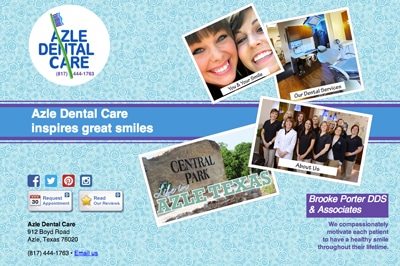
Azle Dental Website
Darlene Ellison branding
Logo Lounge trends 2014
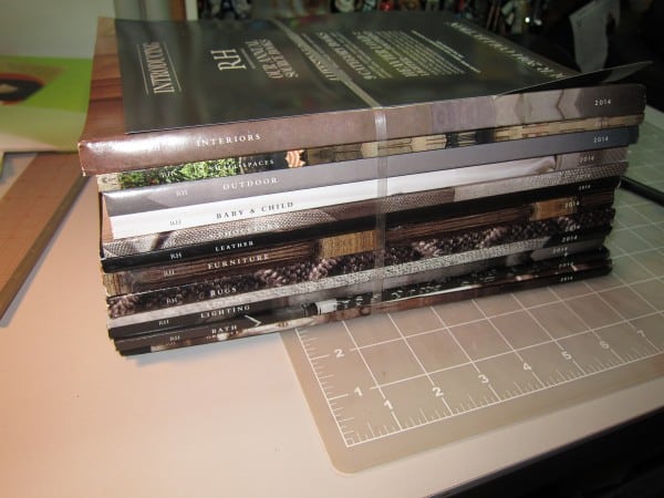
Restoration Hardware Gives Print a Bad Name
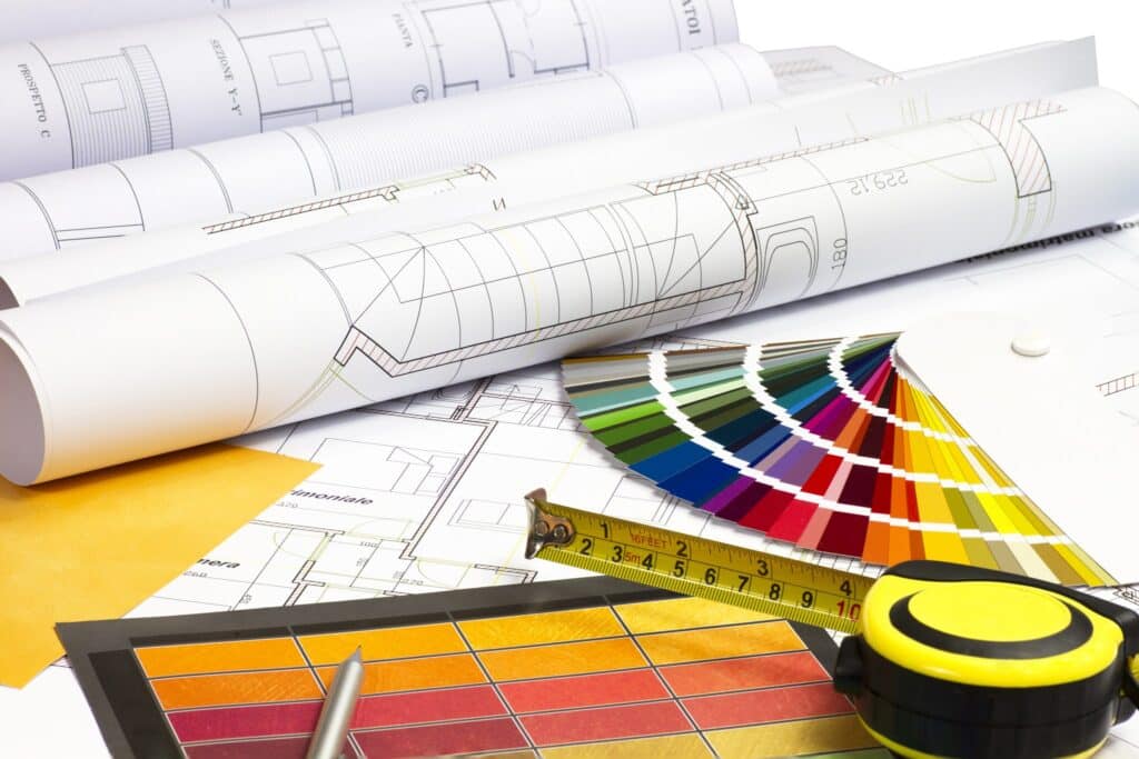
Everything I know about website design I learned getting my interior design degree.
Fun with Homonyms