Everything I know about website design I learned getting my interior design degree.
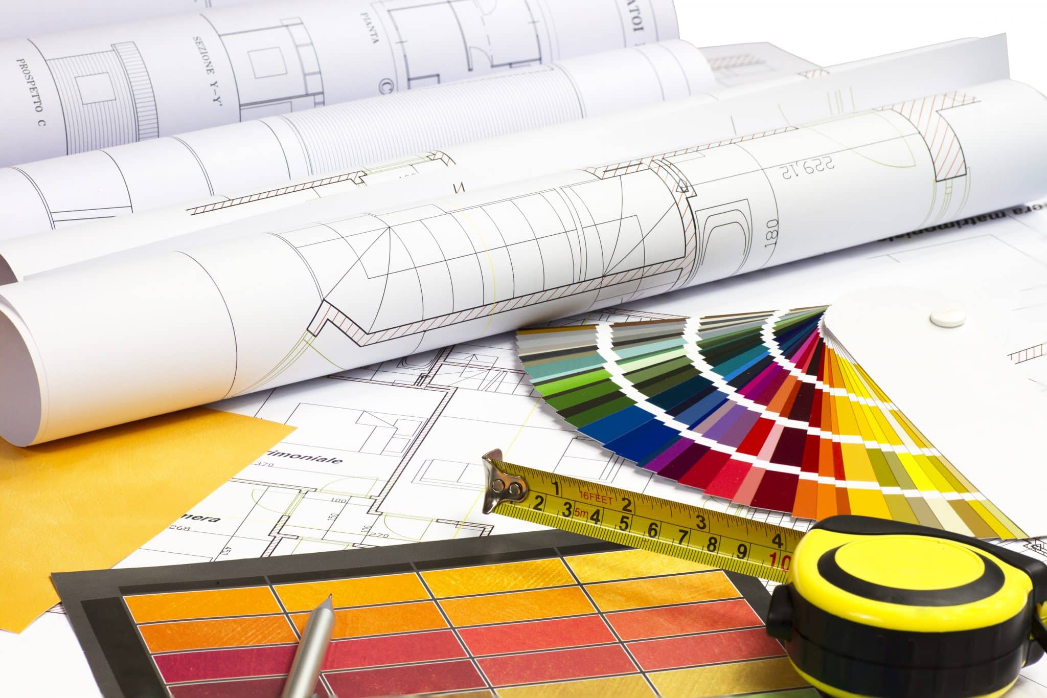
 Well, not everything, but a really good foundation. Of course there are the obvious elements of any fine arts education – balance, rhythm, contrast, color theory, focus – what we learned in “Two-Dimensional Design 101.” But I was taught that what differentiates “design” from “art” is usability. A well-designed object doesn’t just look good, it performs its function well. It considers not only classic elements we learn about fine art, but also the needs and experience of the user. In good design form still follows function.
I was lucky to have been taught by Geraldine Wilson, who constantly reminded us that “good design is good design, whether you’re designing a spoon, a room, or a painting.” She could not have anticipated a website back then. If she did, I’m certain she would have included it in her list. What Gerri taught me about designing an interior space is completely applicable to the work I do today designing websites.
Traffic pattern. A well-designed room considers the traffic pattern – how people get from one place to another, using the most important and most frequent routes and destinations. A well-designed website makes it easy for people to find what they are looking for and get where they want to go.
Usability. In interior design, we talk about “ergonomics” and “human factors” – making the space and the furniture fit the people. These concepts should be incorporated into all space and product design. When we design a website, we talk about “usability” and “user experience.” It’s the same concept – the design needs to first and foremost fit people and be appropriate to how they work and live. It considers different users with different needs – a variety of sizes and abilities, and different degrees of familiarity with the space. In the case of web design, we also need to consider the variety of equipment people will be using to visit the site.
Decor. The decor of a well-designed room will make people comfortable. It will use aesthetics, furnishings, lighting, color and materials to communicate something about the owner – position in society, level of formality, professionalism, traditionalism vs. modernism, innovation, for example. This is an unspoken language that people take in instantly, often without realizing it. The “look-and-feel” of a website will do exactly the same thing. A website is often the first impression people have of your business, just as a physical space may be. It can be designed to demonstrate your professionalism, competence, and concern for the experience of your customers. It can communicate a sense of fun and adventure. It can show that you’re all business, or a cutting-edge innovator.
Focus. Retail space designers masterfully design the space to focus customer attention where they want it – usually towards the most profitable merchandise. Some examples are lighting and floor surfaces that steer people and their attention where the merchant wants it. Retail websites will use similar techniques to focus our attention on the most profitable merchandise that we are likely to buy. They also employ layout, balance, contrast and color to focus our attention on “buy now” buttons and search features, and of course make the path to the checkout as clear and simple as possible.
Maintainability. A quality design will use durable materials that are easy to keep clean, especially in spaces like hospitals and restaurants. In some commercial installations factors like ease of reaching and changing lightbulbs are critical to controlling maintenance expenses. Once again, a good design will take the purpose of the space into account. A maintainable website will be easy to update, and will not depend on proprietary software that is likely to become obsolete.
Execution. A good space, whether “virtual” or physical, does not end with the design. Both depend on high-quality, professional execution and attention to detail to ensure that the end product lives up to the client’s expectations for usability, professionalism, and maintainability.
Gerri’s second favorite expression was “there’s nothing new under the sun.” Even when we’re talking about website design, the same tried and true principles are as relevant – and as necessary – as ever. Call me to explore how the principles of good design can improve your company’s website.

Kim Schlossberg
Content goes here .. (2)
Share this entry
How 2020 can make 2021 better

Welcome to the Kim Schlossberg Designs newsletter
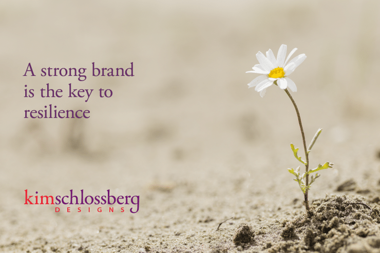
A Strong Brand is the Key to Resilience

29 Ways to a Shine at a Trade Show
How to Make Your Next Stage Your Best Stage

Housing Crisis Center 2013 Annual Report

Housing Crisis Center Patriot Party Invitation

Housing Crisis Center Website
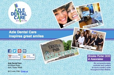
Azle Dental Website
Darlene Ellison branding
Logo Lounge trends 2014
Restoration Hardware Gives Print a Bad Name

Everything I know about website design I learned getting my interior design degree.
Fun with Homonyms